Global Settings
Last updated
Last updated
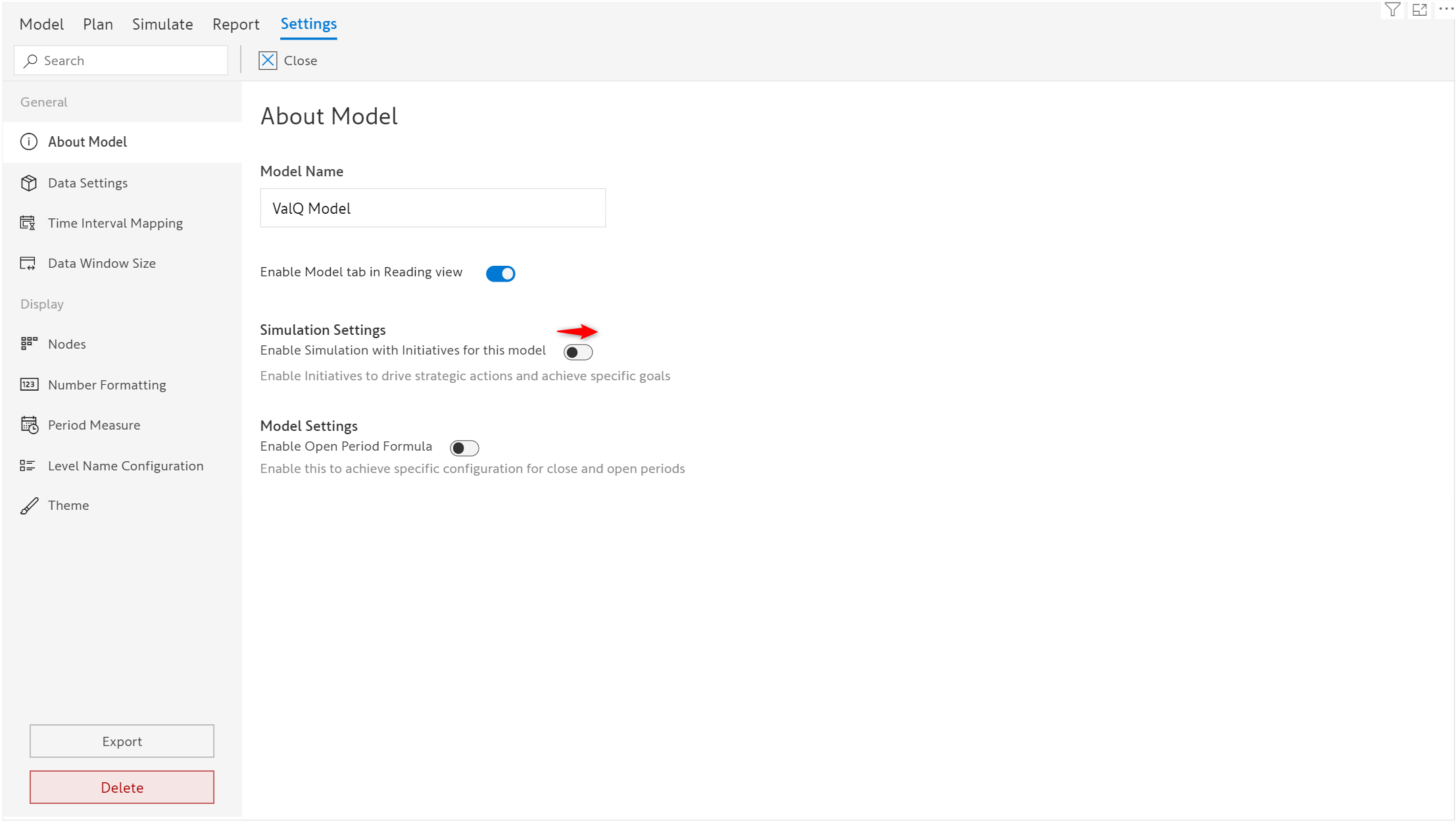
The Settings tab allows you to configure global-level settings for the visual.
To access the Settings menu, go to the Model Tab and then click Settings on the toolbar at the top.
Settings are categorized as General and Display, within which many sections are available. You can also use the search box to jump to the required sub-menu directly.
The name of the model can be changed here. This will appear at the bottom right corner of the screen in all the tabs.
By default, the model tab is available only in the editing view in the Power BI service. Toggle this button to use the model tab in the reading view.
A sample ValQ model looks as shown below before enabling this option.
After toggling on this button, the report now has the model tab in read mode.
To create multiple initiatives within your simulations, you can enable this toggle button.
By default, this feature is disabled. To know more about initiatives refer to this section.
Enabling this button allows different node configurations for open and closed periods. To know more about hybrid period configuration, you can refer here.
The Data Settings menu helps in transforming the data that is added to the visual in the desired manner before you can start building the model.
You can break down the data series added to the visual, into multiple series using the Split Series option.
Note:
The Split Series option gets enabled only when the visual is mapped with the data series containing data from multiple years.
Suppose the time period data you have assigned is not in a hierarchy and has custom time formats like 2023Q1, 23, Jan, 07, etc., you'll need to verify whether the Time Interval Mapping is automatically done by ValQ. Otherwise, you'll need to map it manually for the visual to identify and map the time periods accordingly before using the Split Series option.
A single data series can be split into multiple series where you can define the starting and ending periods for the fiscal year like April to March, Q1 to Q4, and so on. Based on the starting period you assign, ValQ automatically configures the ending period.
In the below example, the visual has a data series assigned, that contain 6 years of data from 2017 to 2022.
By clicking the Split Series option, a pop-up appears on the screen where you can define the start period of the fiscal year. Since April is chosen as the starting period, ValQ automatically fills the end period as March.
As shown in the below example, the source series is split into six separate data series for each fiscal year from April 2016 to March 2022.
Let us now explore the different columns available here.
Source: This refers to the initial data series assigned in the Values field before splitting the series.
Name: This refers to the multiple series names. They can be renamed by the user in the Split Series pop-up window. By default, the series name starts with the end year followed by the name of the source data series.
Type: This column contains details about the source of the data series. 'Native' type refers to the native Power BI series assigned to the visual, while 'Plan' refers to the plan series created by the user.
*Forecast Start: This feature used in the hybrid formula is still under development.
Previous Series: The available data series are mapped to their respective previous series (series that comes before logically) by ValQ automatically. Users are allowed to change the previous series if required.
Excluded Series: In this column, you can choose to exclude any of the data series that are not required. The last two recent data series cannot be excluded as they become the default baseline and comparison series.
The excluded series, though excluded in the Plan, Simulate and Report tabs, would still be available for calculations and formula reference.
After splitting the series, you can compare and simulate any two series as baseline and comparison.
If the time periods are assigned as individual fields instead of using a time hierarchy, ValQ automatically maps them to the model using the custom formats as shown in the below image.
In some cases, when mapping is not done automatically you can map the time periods manually as per the time format.
In the below example, 'Year' is not mapped.
Let us see how to map the time periods manually in such cases.
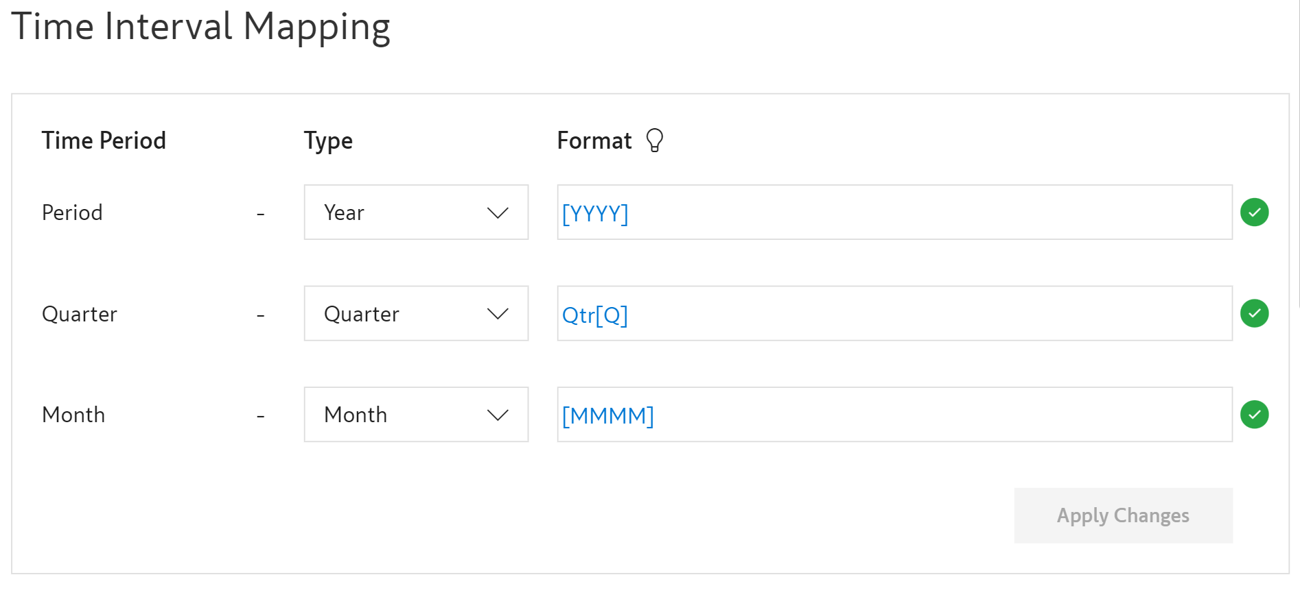
Three columns are listed - Time Period, Type and Format.
Time Period: ValQ pre-fills all three time periods in this field (Year, Quarter and Month) based on the data you assigned in the Time Period field.
Type: Depending on the nature of the data select the appropriate time period from the dropdown list like Year, Quarter, Month or Day.
E.g. If the time period is of the form 2022 Q2, enter [YYYY] in the Year field and Q[Q] in the Quarter field to map it.
When the green tick is shown verifying that the entered format matches with the available time label, click Apply Changes. This ensures that the visual accepts the data in the appropriate time format.
Using the Data Window section, you can load additional columns or periods from the data source into the model. The Max Columns is set as 15 by default and can extend up to 60 based on the data you assign, beyond which the visual would display a warning, 'Too many 'Month' values'.
At this point, go to Settings->Data Window Size where you can increase the Max Columns to the required number up to 1000.
All the display-related settings are available here.
The Nodes menu has a bunch of checkbox options with regard to how the nodes should work. They are explained below.
Conditional Formatting: Check this option to apply conditional formatting to the nodes on the Simulate tab based on the node's simulation impact instead of variance.
Advanced: Here, using the first option you can specify the model to use manual values for the nodes whose data source value is empty. The other option is used to disable the editing of nodes in the Plan tab whose Simulation Method is set to None.
Node Customization
Two node presets are available to customize the layout style of the nodes. Preset 1 is the default style.
The Number Formatting menu has options to change the suffix of scaling and formatting the display settings of numbers.
With the Period Measure menu, the labels of time period measures such as Till Period, All Periods and Simulation Period can be renamed.
Till Period refers to all the periods leading up to the starting simulation period. The Exclude Active Period checkbox can be used to exclude the starting simulation period in the Till Period.
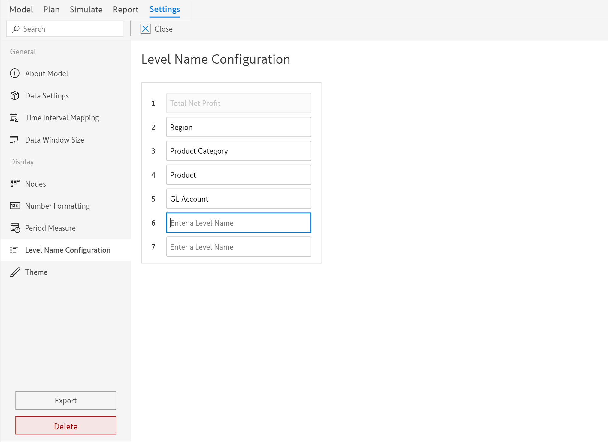
The levels are named by the visual based on the categories assigned in the Visualizations pane. Double-click on the text to rename any level except Level 1 which would always be the name of the root node.
The Theme menu has options to change the font style, chart theme and logo to be displayed along with the model's name. The ValQ logo is available in the visual as the default logo which can be replaced by any 500*500px jpeg or png file.
Export is provided to get the encoded text of the entire visual, which can then be used to import the model into a new visual.
To export the model, click the Export button at the bottom left corner of the Settings window. A pop-up window with encoded text is displayed which can be downloaded by clicking the Download button.
The text file gets the model saved in your local system. This exported file can be shared and used to create a new model. The steps to create a new model with the exported text can be found here.
The current model can be deleted using the Delete button in the Settings tab. To permanently delete the model, click Yes in the Delete Model confirmation pop-up.
Format: Finally, under the Format column, key in the pattern, the way the values are available in your data. Type [ or hover over the help icon to open the list of suggested formats.